


These are a few of the many explorations for the label. The goal was to have a solid shelf presence while making the juice prominent and differentiating from the competition. The idea behind using the engraving art was to represent the ingredients as clean and pure while juxtaposing the vintage art with modern typography to portray the brand as fresh and considered.


In the end, a centered and more straight forward concept was chosen with a few rounds of fine tuning hierarchy and exploring treatments of the brand presence.


Once the layout was solved, a new discussion around the illustration style arose. The client wanted to be sure that the illustration and it's composition was the best representation of their product. We took a look at a photorealistic style. Not having a budget for custom illustrations, we pieced the compositions together from stock imagery and used some photoshop magic to give the images a painterly feel.


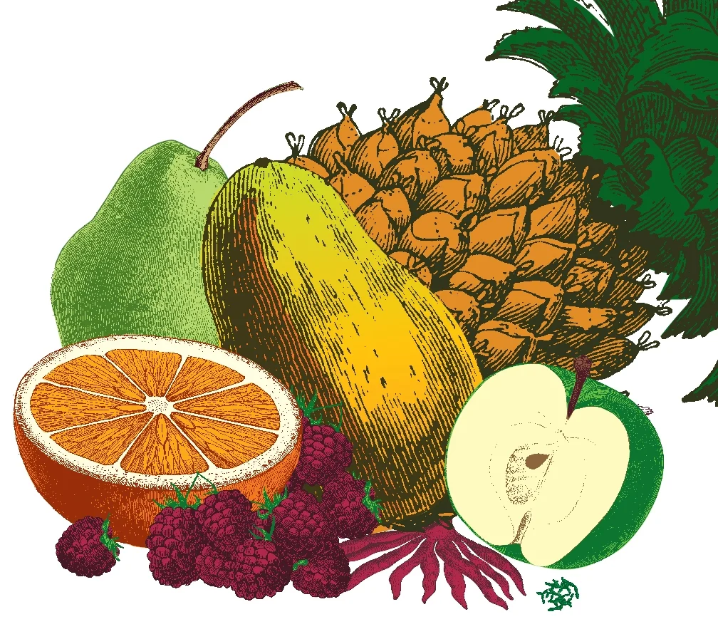


After much experimentation, the client decided that the original style was best for this launch. The challenge now was to represent each flavor with the correct ingredients and their predominance within the flavor profile while still differentiating each of the flavors from one another.

The final labels used elements, such as the red band, from the original designs so that customers would easily be able to recognize the brand.
